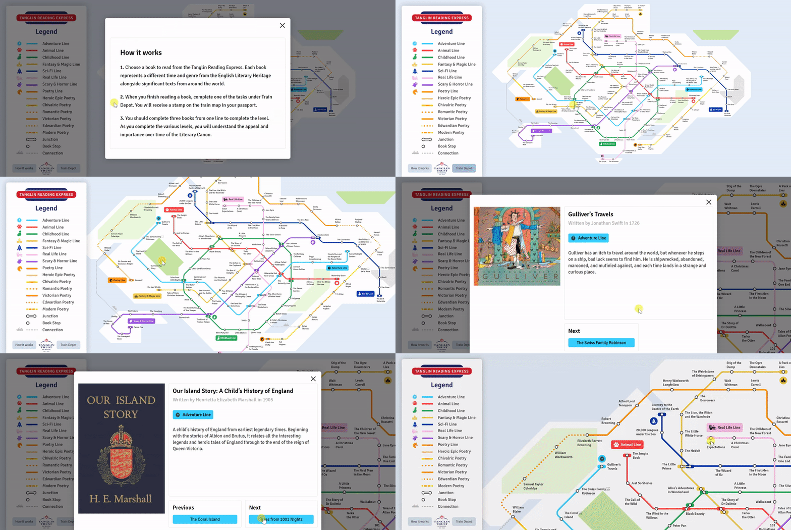
My time as a UX/Brand designer in Singapore’s Edenspiekerman exposed me to various creative fields that I would otherwise have given no second thought to. At the agency, I had the pleasure of designing a subway map system that acted a reading list for elementary school students at the Tanglin School. Through this project, I learned a bit more about map and communication design.

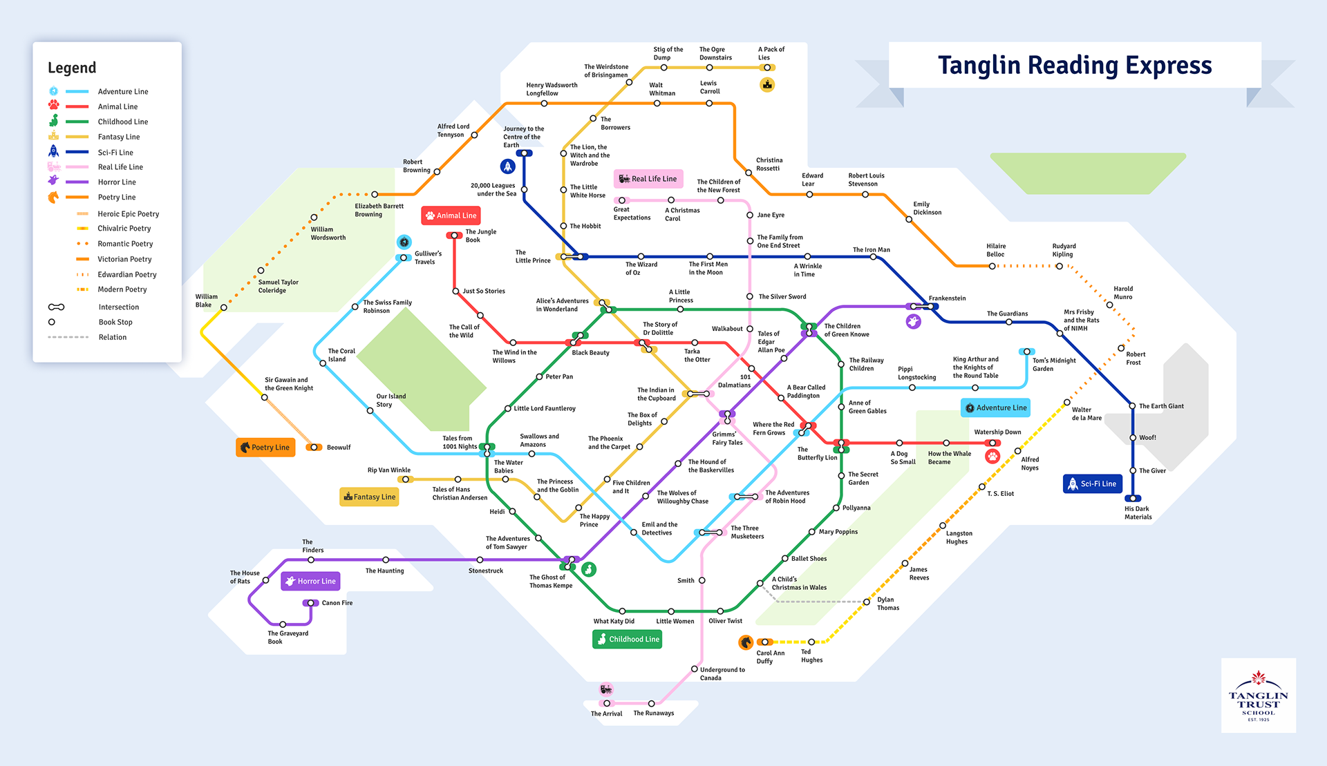
The reading list is based off a subway style design emphasizing the silhouette of Singapore. Each station represents a particular book to be read, while each subway line represents a particular grouping of books (often belonging to the same genre). Intersection of stations implies that the book belongs to more than one group. Each Group is labeled at the head of its subway line.
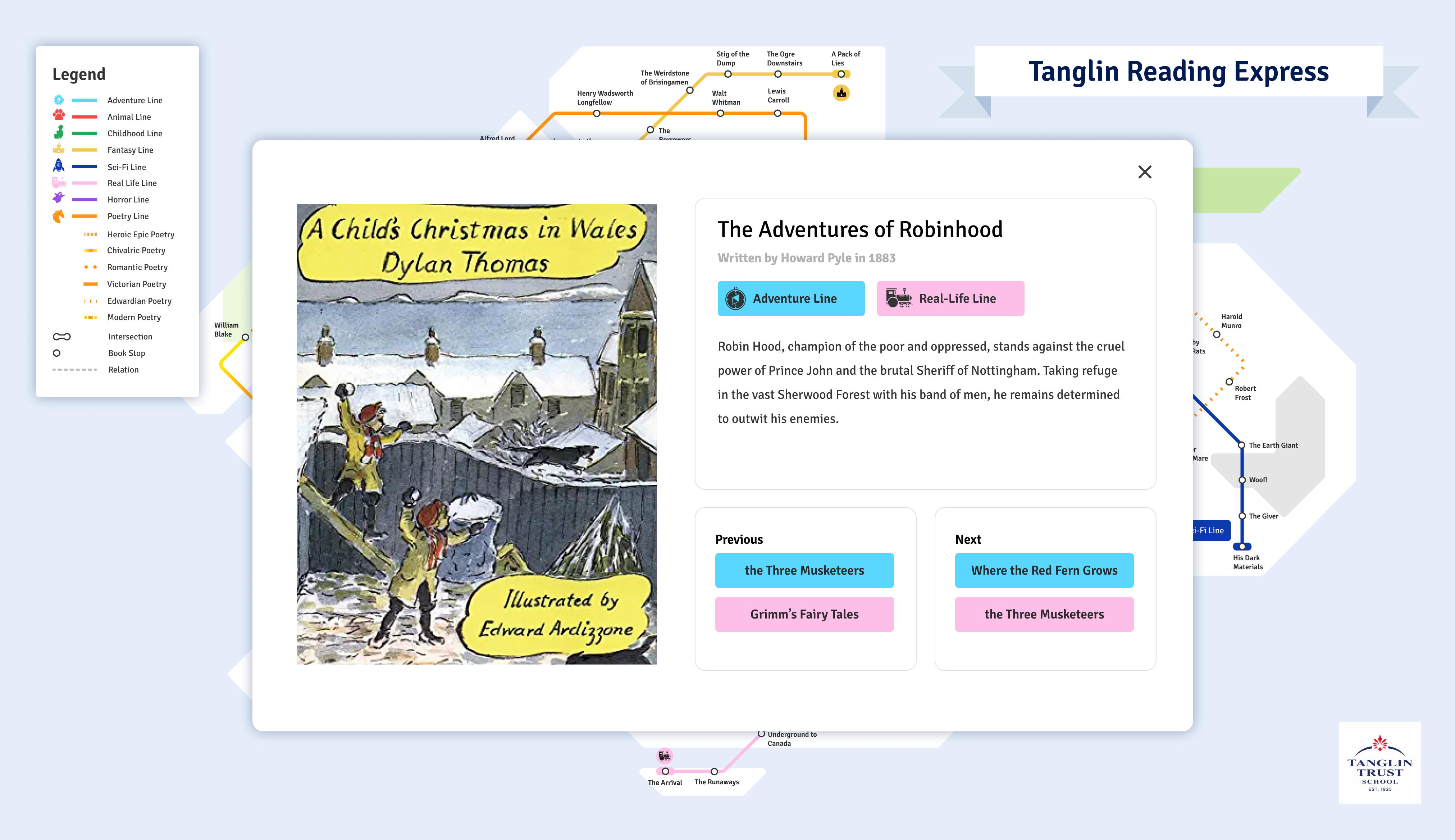
In addition, one of the students at the school designed all the logos that correspond to a certain subway line. I digitalized these logos and added them into the map! The geography of the subway lines themselves are loosely based off the actual construction of the Singaporean subway system itself. licking on a particular station brings up the title, description and genre of each book.
 clicking into a particular station brings up the book description
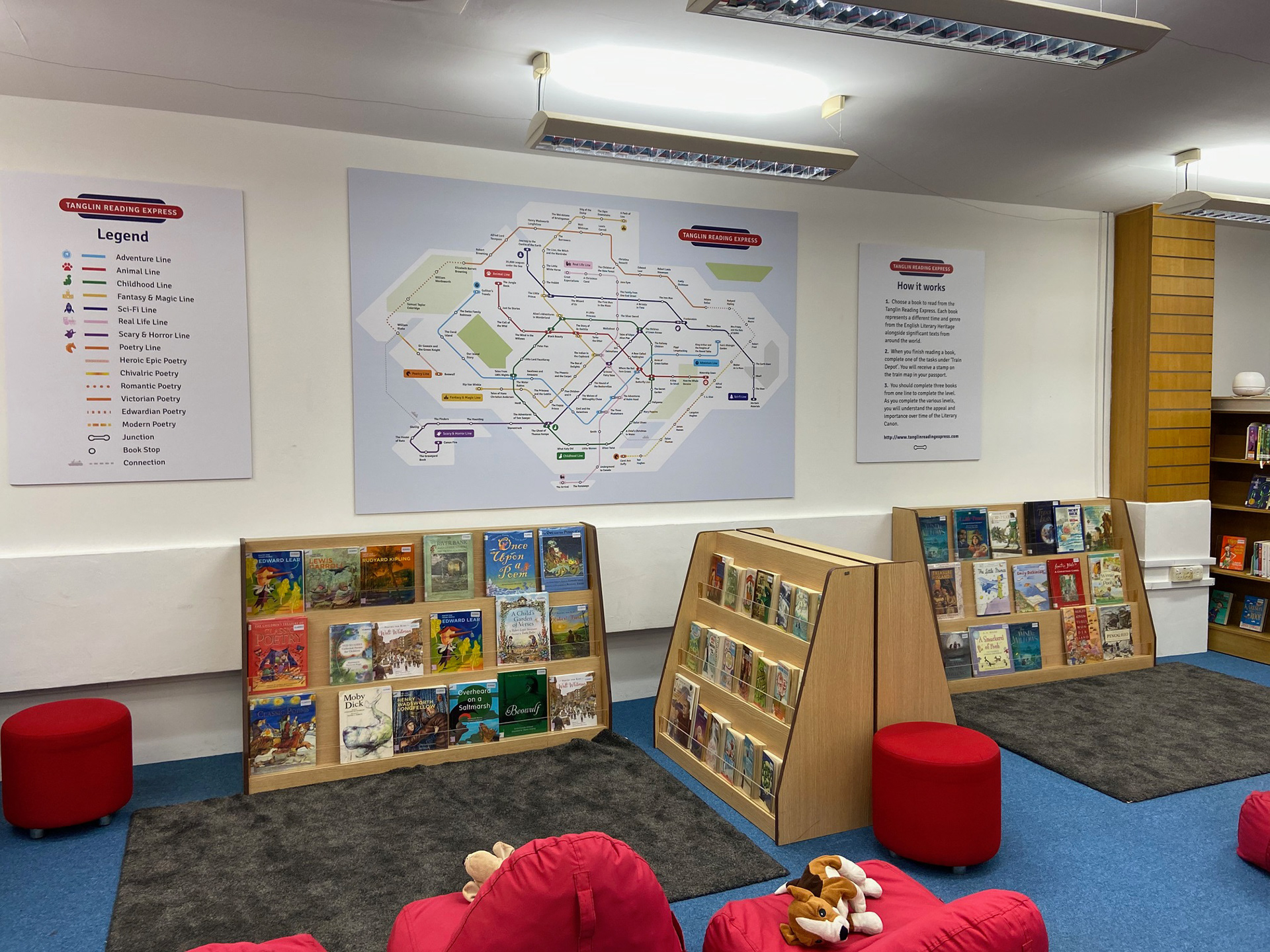
Below is the final result printed out in one of the school classrooms.

