Context
Hack the North is an annual hackathon held at the University of Waterloo. Each year, it brings 1000+ students from 6 continents around the world to a 36 hour event. There, participants get the chance to create, design, and execute anything they want. 2018 marked the 5th year anniversary of the event, to celebrate this, we wanted to introduce a rebrand.
Rebranding Hack the North
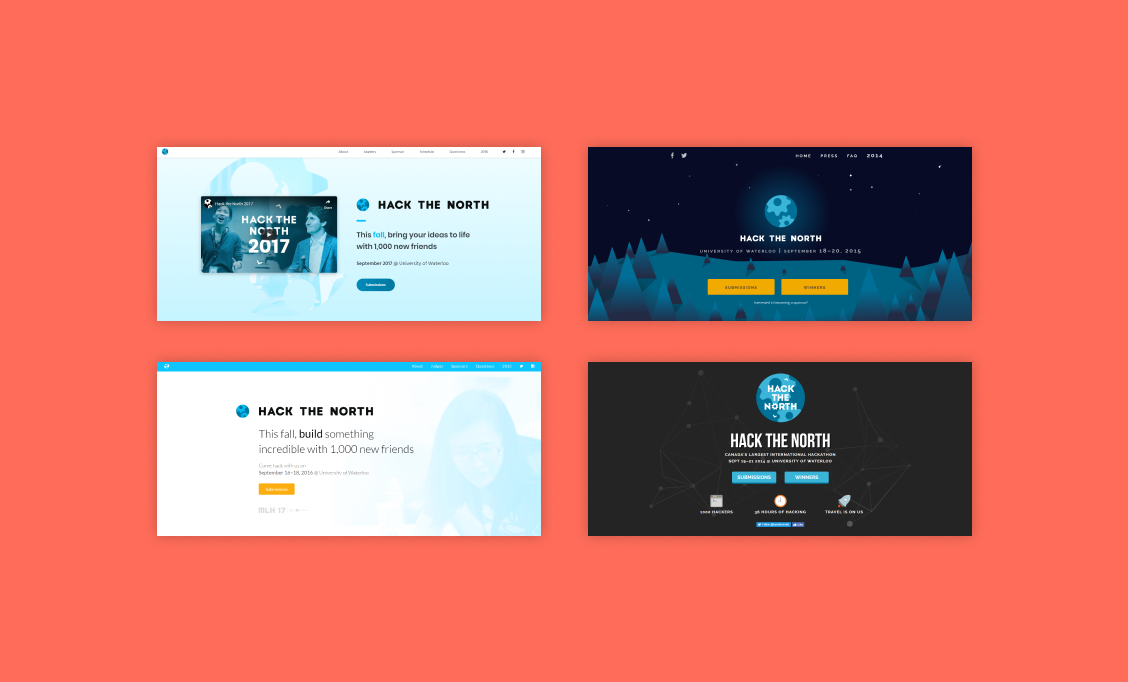
In previous years, Hack the North associated with various blue themes. It was to appear professional, and appeal to sponsors. However, we wanted this year’s brand identity to celebrate the hackers at the event. Joanne and Jeffrey came up with the updated branding.
The Styleguide
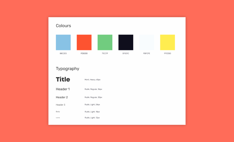
Joanne and Jeffrey chose lighter & brighter colors for the brand in order to set a more playful mood. They also kept to lowercase wide lettering for titles and subheadings to appear less intimidating to the site viewer.
Redesigning the Hack the North Homepage
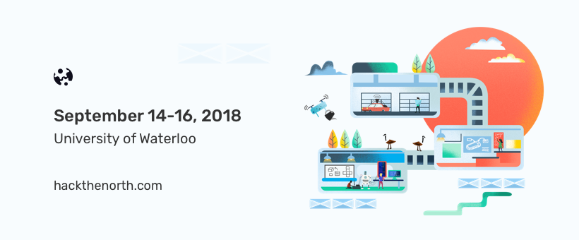
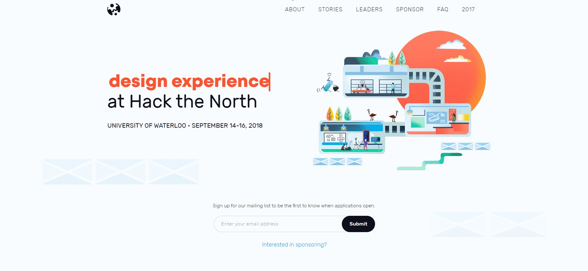
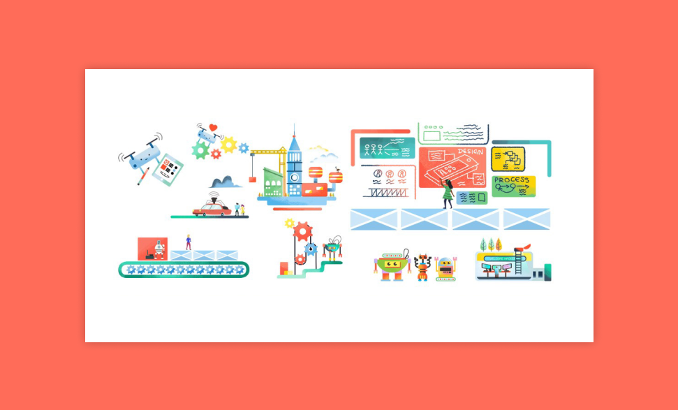
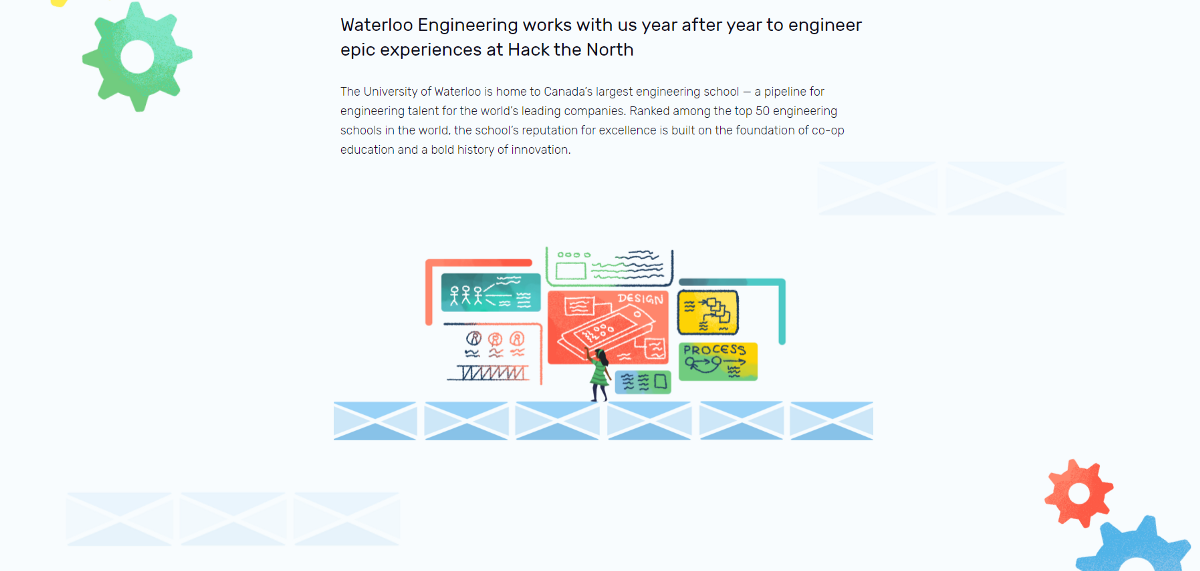
For the front page of our site, I conceptualized a three room illustration for the homepage that showcased the three focuses of Hack the North 2018 (Coding, Hardware & Design). The Interior and Exterior of each room reflected E5, the engineering building where the hackathon takes place annually. Jeffrey then brought the central illustration of the site to life, as we wanted to have more interactivity and engagement between the viewer.
Tone of our Brand
color, style and content of the illustration would set the tone Hack the North 2018. The colors gave us a big leg up in creating a welcoming and diverse platform, but there was more to be done.
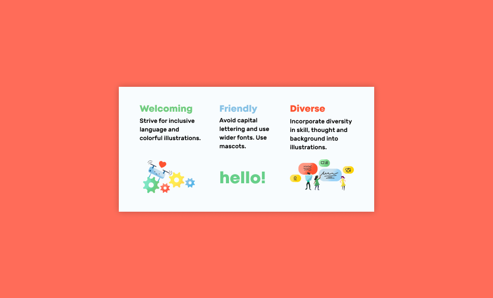
Illustration Style
Graining our illustrations and keeping silhouettes organic allowed the illustrations to mimic hand drawn art. The intent of that was to show that the Hack the North organization was run by real, non-linear people. We weren’t elite, we were real university students.
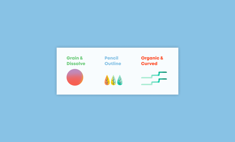
Illustration Content
We also wanted to emphasize was the diversity in skillset at Hack the North. The design team focused on three disciples, programming, design and hardware. All the characters in our illustrations span different backgrounds and do different things.
Reoccurring Themes and Motifs
E5 Tilings
Elements unique to the University of Waterloo like the checkered tiling on the E5 building were incorporated to create a relation between the physical location and the event. In addition, they bridged the transition between text and illustrations.
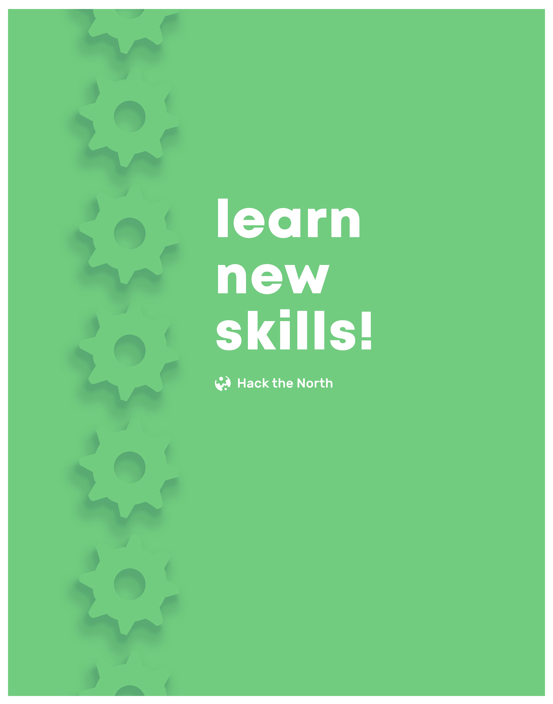
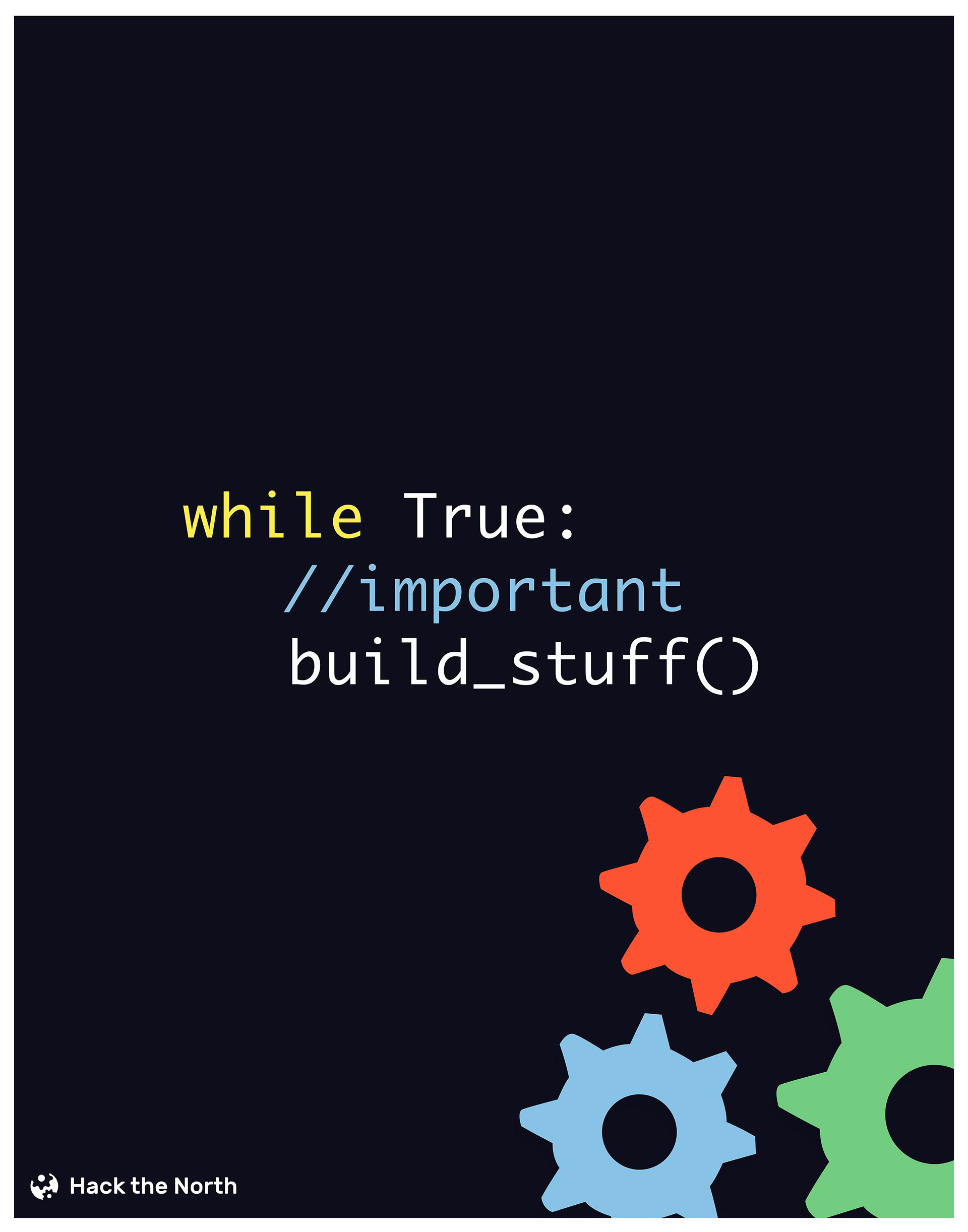
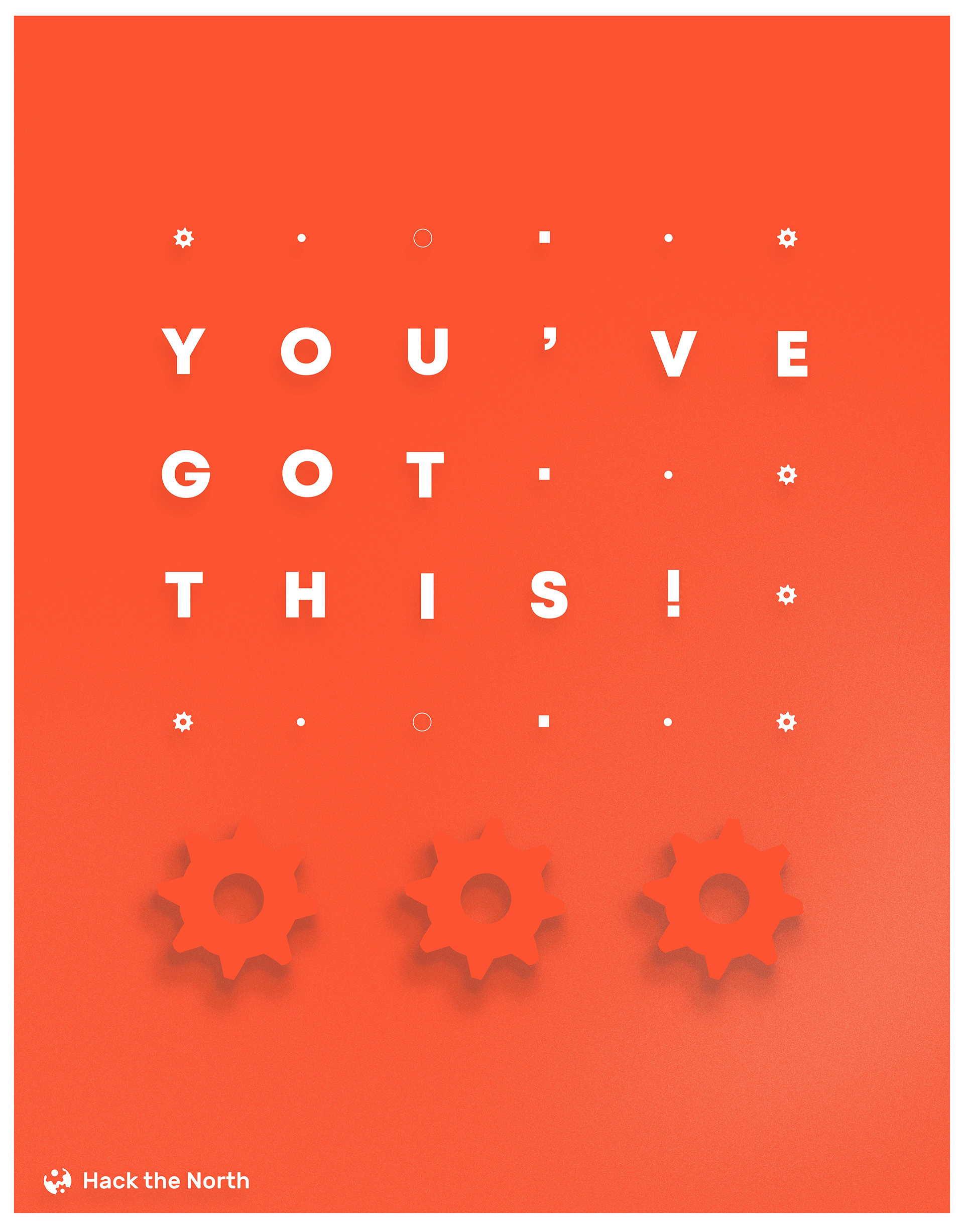
Gears
The second reoccurring motif was the animated gear. These gears are found in our web-page as well as social media assets. The team wanted to keep some remnant of the previous branding(s) as they would provide some familiarity to and otherwise sudden change in brand.
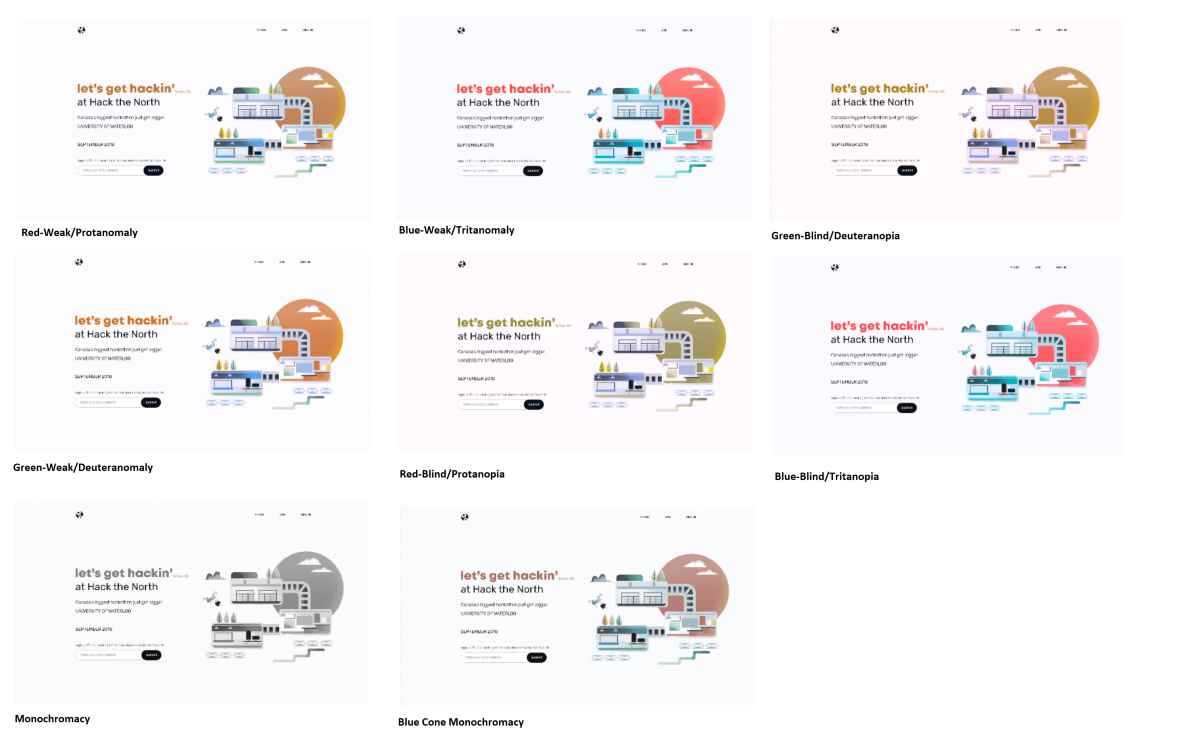
Designing with Accessibility
we aimed to be WCAG 2.0 AA compliant. This meant making sure low contrast images did not affect the overall flow a d that restrictions of type.
The Hack the North 2018 Webpage
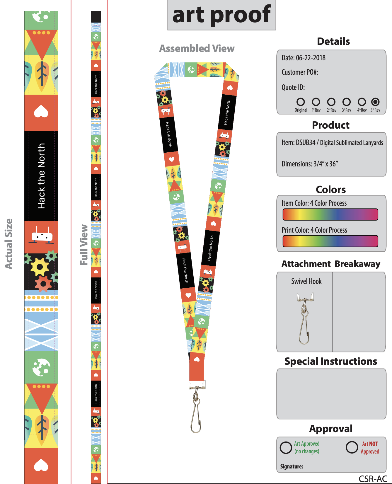
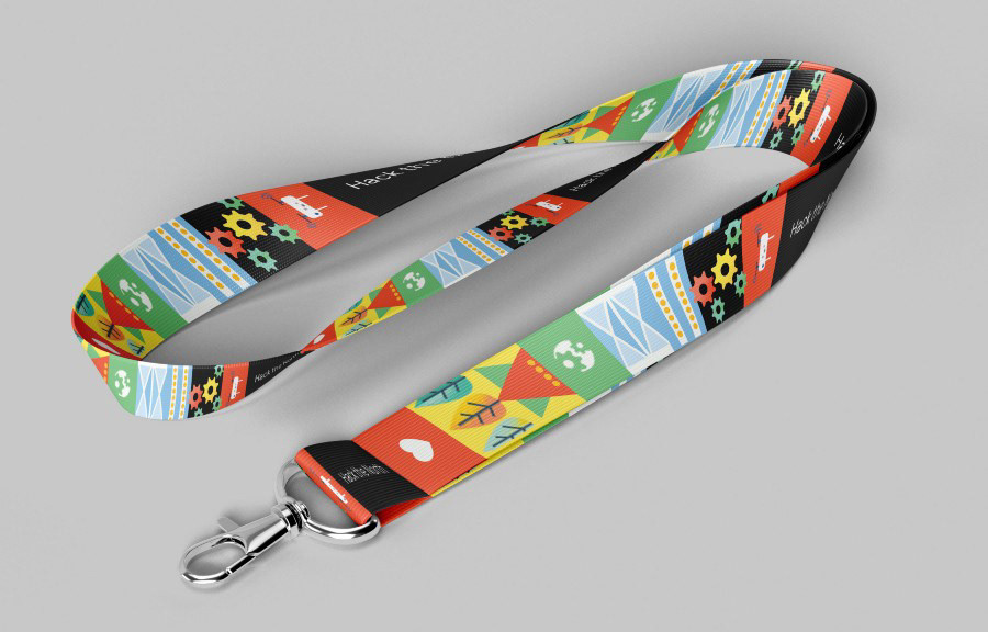
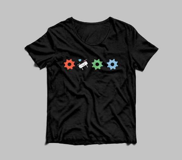
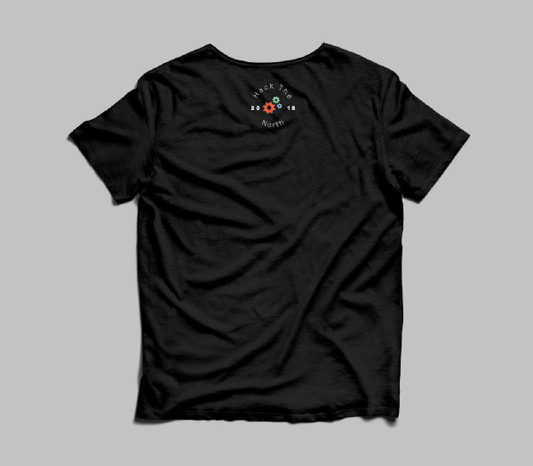
Designing Swag
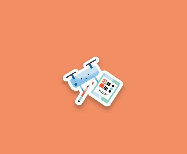
In the summer, I worked with Helga, another designer to deliver physical assets. One task was to design the swag given to hackers the day of event. We worked on a variety of things from stickers to shirt apparels. Our stickers followed the illustrative style on our website to keep consistency.

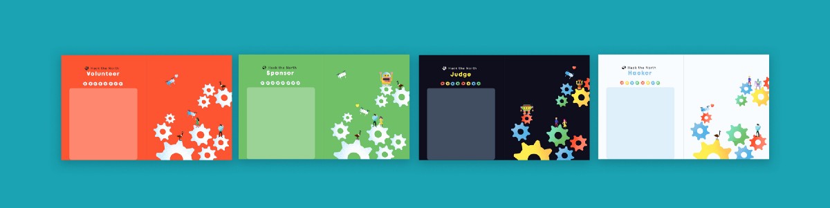
I also created badges used to tell volunteers, sponsors, hackers and other roles apart at the hackathon. High contrast colors were chosen to aid differentiation.
We also designed apparel for the event.
Graphics, Graphics, Graphics!
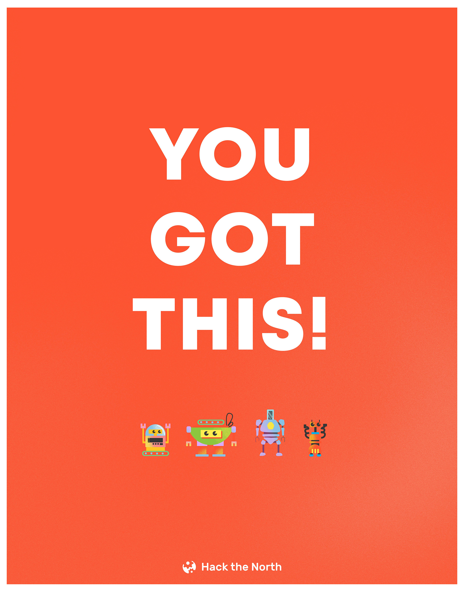
As a design bonus, I decided to create some motivational posters for the day of the event. I had full creativity to do whatever I wanted, so here are some of the final concepts.
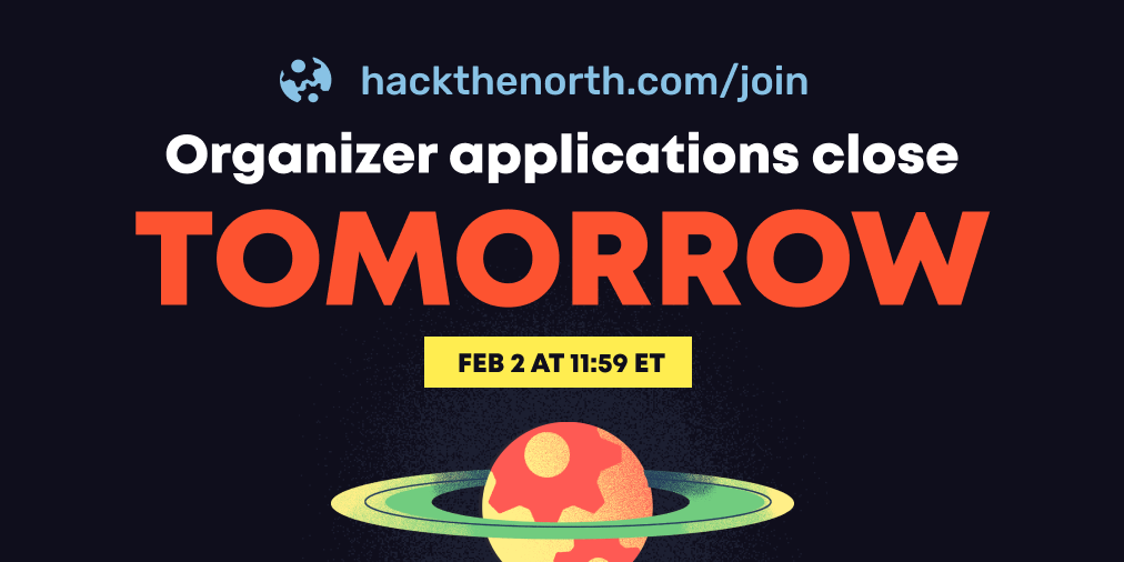
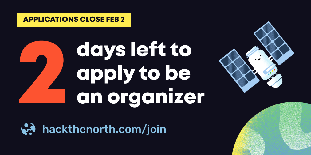
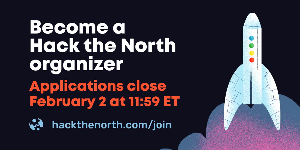
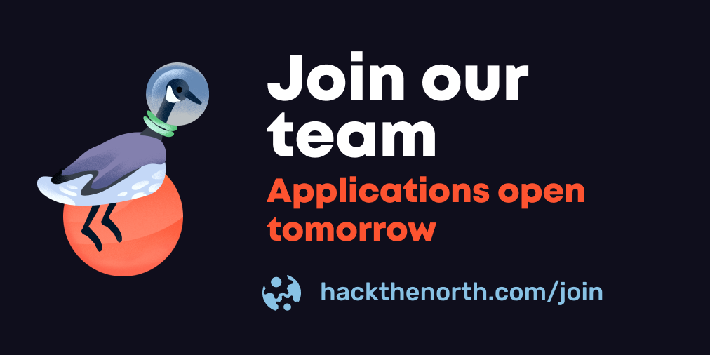
2019 Recruitment
Finally, since hack the north recruits new team members annually, our design lead for the 2019 year Stanley Huang decided to use some of the illustrations I created (but never ended up getting used) for social media graphics.